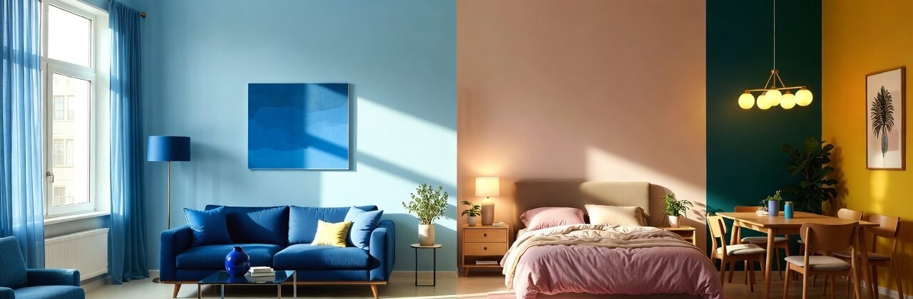
The Psychology of Colors in Interior Design


 WhatsApp